
Redesigning an E-commerce Website for Book Sales
- Sep 3, 2023
- 5 min read

Role: UX, UI, Brand & Strategy
Overview
Debra A.K. Thompson is an empowering self-help author who draws from her own personal experiences to passionately motivate and encourage women to transform their lives through introspection and reflection.
Problem
Debra, is deeply committed to crafting empowering self-help books for women, drawing from her own personal journey. However, she realized that her current website did not effectively convey this profound insight and failed to resonate with her intended audience. Despite her unwavering efforts, the site was not gaining the traction she had envisioned, prompting her to seek new strategies to better connect with her readership.
Solution
I revamped her website, crafting a brand-focused website that aligned with her targeted user goals while effectively serving her business objectives.
The Process
Understanding the goals
I initiated a comprehensive kick-off meeting with Debra to understand her aspirations and vision for her website. She expressed her genuine appreciation for my assistance, and her key priorities were to create a website that authentically reflected her unique persona while effectively driving sales.
Business Goals
Clicks | Retention | Sales |
|---|---|---|
Increase the amount of user visits | Keep users on the site longer | Generate sales |
Main Focus Areas
With the business goals and my detective hat on, I first started with a design audit. I wanted to observe the current site from visuals, content, and overall flow.
In terms of site flow, the overall structure was well-designed, but there were three key areas that required improvement:
the UI
the shop section
and the blog
These particular areas were acting as dead ends in the flow, impeding seamless navigation and user experience.
The UI

In addition to the previously mentioned dead ends, it was crucial to consider Debra's visual impairment in the website redesign process. Despite the well-coordinated color scheme, the overall UI lacked cohesiveness, with an excess of white space that rendered the site bland and failed to capture users' attention.
Additionally, the contrast between white text on blue and vice versa was suboptimal, making it less accessible for users and compromising the overall user experience. Addressing these concerns while accommodating Debra's specific needs was a pivotal aspect of the redesign effort.
The Shop

The shop section of the website was found to be lacking. There were empty product listings that lacked SEO-friendly titles and descriptive information, making it difficult for users to understand their options.
Additionally, the absence of product photos left users without visual cues to comprehend what they were viewing.
These shortcomings collectively hindered the shop section's effectiveness in providing a seamless and informative shopping experience for users.
The Blog

The absence of a clear hierarchy of information on the website could potentially confuse readers and undermine their understanding of the content.
Also with the lack of visual elements, such as images or graphics, fails to captivate users and entice them to engage with Debra's posts.
The titles of the posts were lacking in keywords, which could adversely impact the website's SEO performance. Moreover, the posts were relatively short, which may not have been sufficient to generate a positive impact on SEO rankings. Addressing these issues was essential to optimize the website's content strategy and enhance its overall effectiveness.
Understanding The Users
Recognizing that Debra's target audience was not clearly defined, I devised a strategic marketing plan to not only establish an audience platform but also leverage data-driven insights to inform my design decisions and enhance the overall user experience.
After careful consideration, I recommended narrowing down her niche to women between the ages of 30 to 50. Leveraging my expertise in social media, I identified Pinterest as the ideal platform to connect with her target audience, and made it her new primary platform for reaching and engaging with her desired demographic.
Why Pinterest?
60% women use the platform
50% of U.S. Pinners frequently shop on Pinterest
Users are 3x more likely to click over to a brand's website
Pinners describe Pinterest as a place of positivity
Nearly 80% of Pinterest users are Millennials
Insights
Through a successful marketing campaign that garnered over 30,000 impressions and 50 outbound clicks to Debra's website, valuable insights were gleaned about her user base.
I utilized Pinterest's Audience Insights tool to gather valuable data, revealing that a significant portion of the users engaging with Debra's posts were women between the ages of 25 to 34. This insight provided valuable guidance in shaping the website's content and design to effectively cater to this specific demographic.
Some User Interest Included:
Inspirational quotes
Healthy lifestyles
Fitness
Leveraging the insights obtained from the marketing efforts, I utilized these findings as a guiding compass in revamping the website into a more user-friendly experience that aligned with Debra's business goals. The redesign entailed not only enhancing the visual appeal of the site, but also updating it to provide a compelling and seamless user experience.
The Design
Written Between The Lines

I placed a strong emphasis on crafting a compelling brand identity that encapsulated Debra's core message of motivation, inspiration, and freedom.
This involved strategic changes to the overall layout of the site to enhance its appeal, traffic flow, and product promotion. I carefully guided users towards three key options: reading the blog, purchasing the book, or following Debra on Facebook.
Through the use of powerful words such as "enlighten," "transform," and "connect," I aimed to evoke a sense of the end result that users could envision, immersing them in a journey of self-improvement and empowerment.
Setting Up Shop

As part of the website redesign, I seamlessly integrated an e-commerce shop to enable users to easily discover and purchase Debra's books directly from her website.
To optimize user engagement, I strategically showcased her most established book as the flagship product, leveraging its previous social proof to further entice, inform, and establish trust with users.
By leveraging the book's reputation and utilizing persuasive messaging, I aimed to create a seamless and trustworthy purchasing experience that would drive conversions and foster a positive user perception.
Content Creation

To enhance the visual appeal and organization of the blog section, I implemented a grid layout with captivating images for each article.
Keeping in mind the target users' interests in inspirational quotes and a positive mindset, I carefully crafted the blog titles to feature more engaging and appealing headings.
By leveraging the power of inspirational content and creating a welcoming atmosphere, I aimed to capture users' attention and encourage them to explore the blog further, ultimately boosting engagement and fostering a positive user experience.
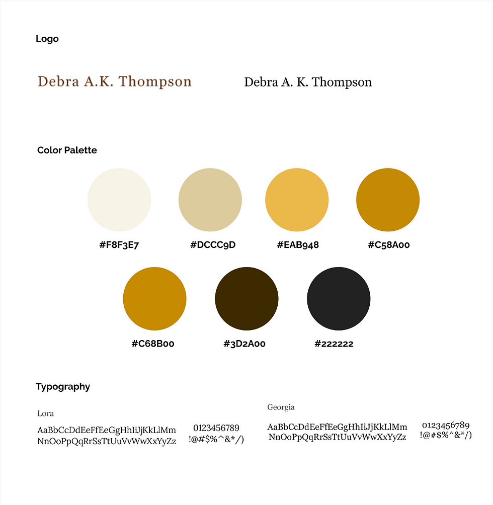
Taking cues from other successful competitors in her field, I noted that they aligned their website color schemes with their book branding.
Drawing inspiration from Debra's books, I carefully curated a color palette that would complement her literary works and convey the warmth and wisdom of her message. The colors selected meet the accessibility standards of Web Content Accessibility Guidelines (WCAG).
The Results
This transformation resulted in a visually appealing website that not only captivates the attention of potential customers but also ensures an improved browsing experience for Debra, who has a visual impairment.
Debra's website experienced a substantial boost in click-through rates, leading to longer session durations and increased engagement from users. This resulted in not only attracting new visitors to her site but also driving more sales.
The improved website design and user experience had a positive impact on Debra's online presence, leading to tangible results in terms of increased traffic, engagement, and sales.
2 min increase in user sessions on site
2 books sold within the first month of site redesign
23 new users in the first month of site redesign
Takeaways
Throughout my UX design process, I gained valuable insights into accessibility and user needs, and learned to view the design process as an evolving journey. This project reaffirmed the significance of crafting copy that resonates with a person's core motivations, and I eagerly anticipate applying this approach in future projects.
One of the remarkable aspects of design is the multitude of ways to arrive at a solution. Considering budget constraints, I utilized free tools to find creative solutions that aligned with project goals. I found great satisfaction in the creative aspects of the project, and if given the opportunity, I would gather user feedback to better understand their journey on the site and identify reasons for leaving.
Overall, Debra expressed high satisfaction with the site's transformation, and it was a fulfilling experience to see her happy with the results.


